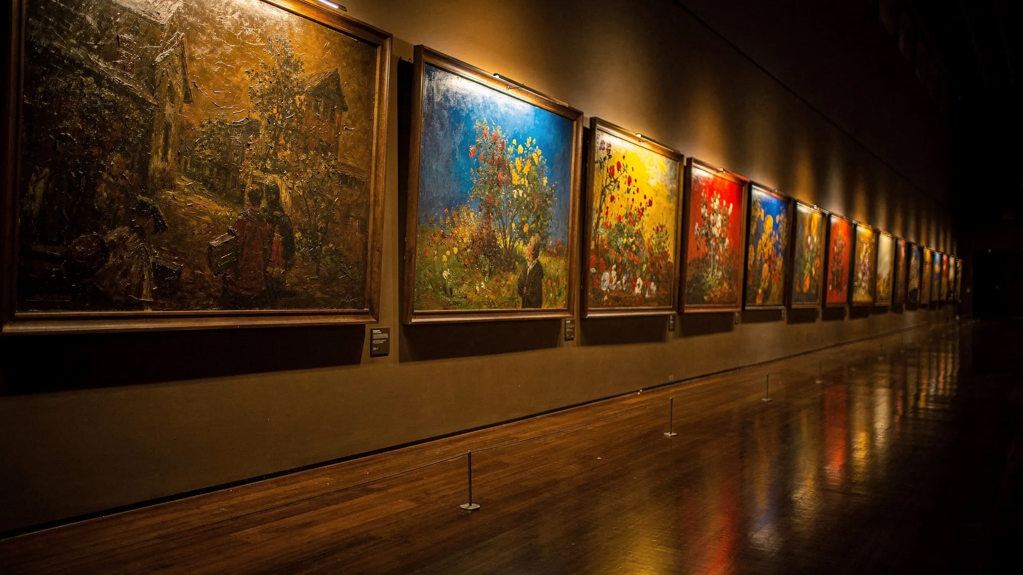
69,486 PAINTINGS SHOW HOW WESTERN ART LEFT THE BROWNS BEHIND
The history of colour in painting has mostly been told in words: the names of colours, the chemistry of pigments, the conventions of each era. Ortensia Forni, Alexandre Darmon and Michael Benzaquen, from the Institut Louis Bachelier in Paris and the École Polytechnique in Palaiseau, with Art in Research and Capital Fund Management, set out to measure it.
They took the WikiArt collection of digitized artworks, used a neural network to remove sketches and drawings, and kept Western painting only: 69,486 paintings from 26 movements, from the Early Renaissance to Contemporary Realism, 39,054 of them dated, from the fifteenth century to 2012. Each painting was boiled down to 10,000 random pixels, each matched to the nearest of 25 reference colours chosen to cover what the eye can see.
Three families of colours, three timetables
Splitting the dated paintings into eleven periods with the same number of works, the authors followed every colour through time. The 25 colours sort themselves into three families:
- Dark earths — brown, ochre, carbon black and a dull blue-black — decline steadily from the start to the end.
- Muted tones — greys, a pale pink, greens, a light blue — gain ground mostly before about 1880, then level off.
- Saturated hues — pure red, yellow, greens, cyan, blues, violet, magenta — stay flat until the late nineteenth century, then rise through the twentieth.
Two stories fit these curves. One is chemical: for centuries, painters relied on earth pigments, blacks and a few costly minerals; many vivid pigments only became available with nineteenth- and twentieth-century industrial chemistry. The other is about subjects: religious, historical and portrait scenes in dark interiors gave way to landscapes, daylight and painting outdoors, and in the twentieth century colour became a subject in itself. The data cannot separate the two, the authors stress — portable paint tubes, for instance, helped both.
Movements that start to stand apart
Comparing whole palettes tells a second story. From one period to the next, the average palette drifts slowly and steadily. But the movements behave differently. From the Early Renaissance to Realism — about four centuries of very different art — palettes stay remarkably alike. In the twentieth century, neighbouring movements part ways: Analytical and Synthetic Cubism went back to palettes close to the old ones, while Fauvism, at the same time, stands among the furthest from them. Colour becomes part of each movement’s signature.
How many colours, and how unevenly
To read palettes more simply, the team uses two numbers:
- sparsity, the share of the 25 colours a painting leaves unused;
- dominance, how unevenly it uses the colours it has — 0 when they share the canvas equally, higher the more unevenly they share it (most paintings fall between 0.55 and 0.75).
Through time, painting follows two phases. Until the 1910s, sparsity falls from about 0.50 to 0.41 while dominance stays around 0.63: painters use more and more colours. After 1950, dominance climbs to 0.68, then 0.69: a few colours take over, as in Pop Art or Color Field painting.
The same numbers measure how far art strays from nature, using 12,000 landscape photographs. Nature uses slightly fewer colours, more evenly. Surprisingly, the movements that stray furthest do not split into figurative and abstract. Pointillism, Fauvism, Pop Art and Minimalism differ in how many colours they use and how unevenly; the Renaissance schools, Baroque and Rococo differ in which colours they use.
Two ways to be harmonious
Finally, the team asked volunteers — several hundred in each of two online surveys — to pick the most harmonious colour balance among abstract images built from the palettes of five famous paintings, by Raphael, Turner, Cézanne, Van Gogh and Rothko. Choices gathered at two opposite poles: many colours with a strong hierarchy, or few colours used evenly. Images in the middle of both ranges were picked least often.
That two-pole taste matches neither the statistics of paintings nor those of nature. The authors suspect that, in a real painting, subject, composition and context reshape what looks harmonious — and they list their own caveats: digital reproductions, ageing varnish and a corpus thin before the nineteenth century.